Graphic Novel
Roles: Creative Direction, Design & Animation
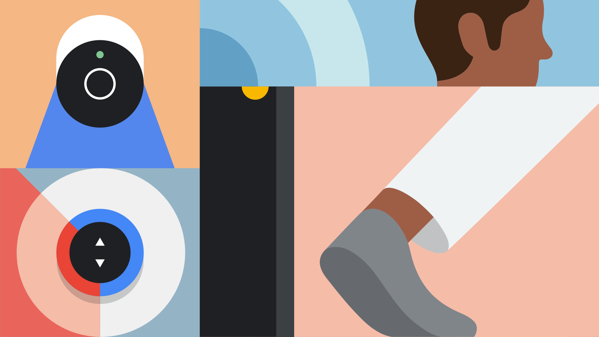
The Google Nest team presented us with the design challenge of creating a new illustration system for the Google Home app that could communicate abstract and representational concepts at a wide variety of scales and perspectives. Inspired by the compositional storytelling of graphic novels, this design system consists of panels that can be used individually, or in tandem with additional panels to convey more complex ideas.




Extended Color Palette
We developed a muted palette to live alongside Google’s core brand colors. The combination of the two palettes allows for vibrant, full frame illustrations that retain brand recognition. By doing away with a reliance on negative space, often white or dark gray, we are able to design a majority of the illustrations at a medium tonal value which allows them to live comfortably in light or dark modes.




Technical Considerations
To maintain the hand-drawn feel of graphic novels within a lightweight file deliverable, we created a workflow to append traditional animation into Lottie. In doing so, we were able to accommodate high-frame-rate motion and frame-by-frame animation in the same file.
Icon System
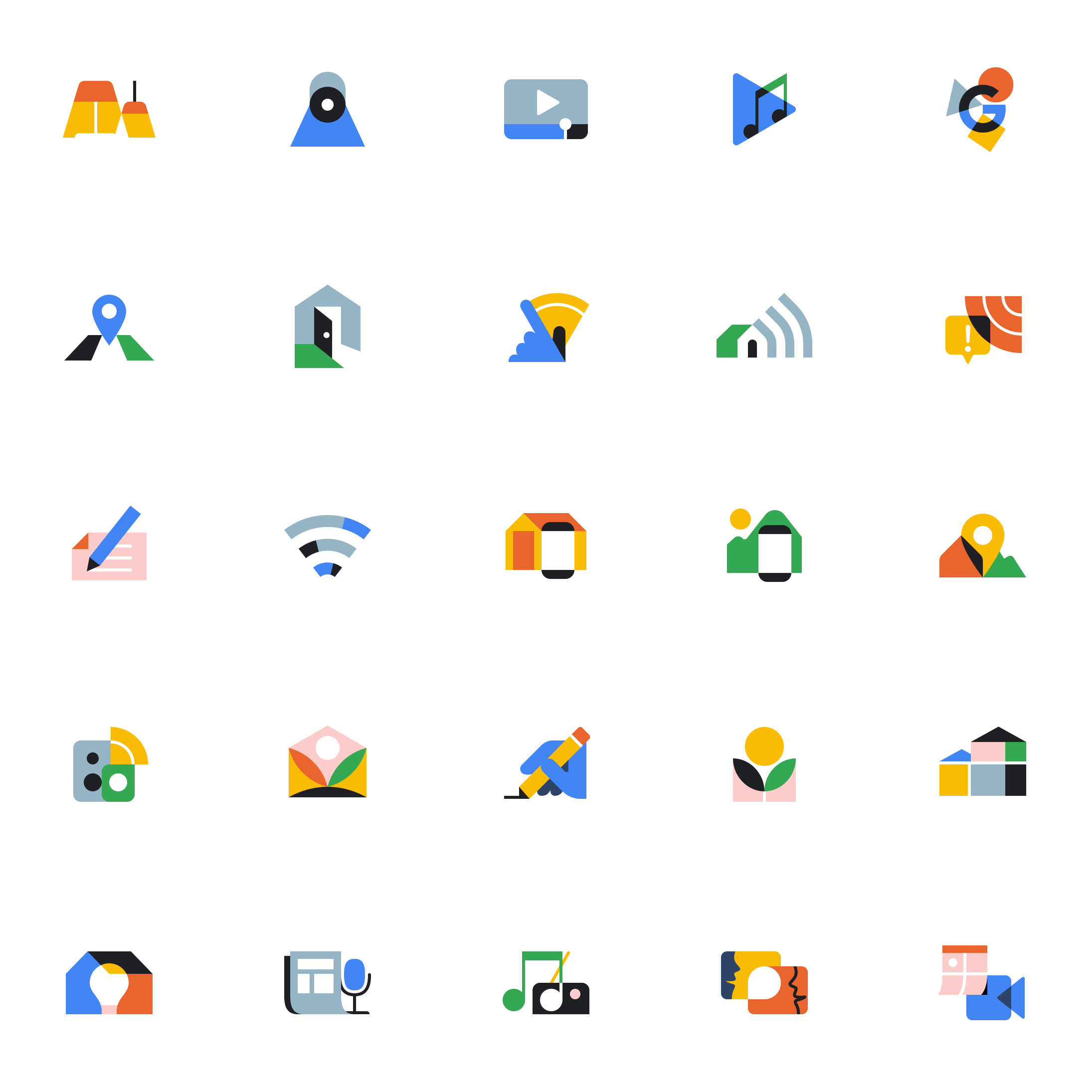
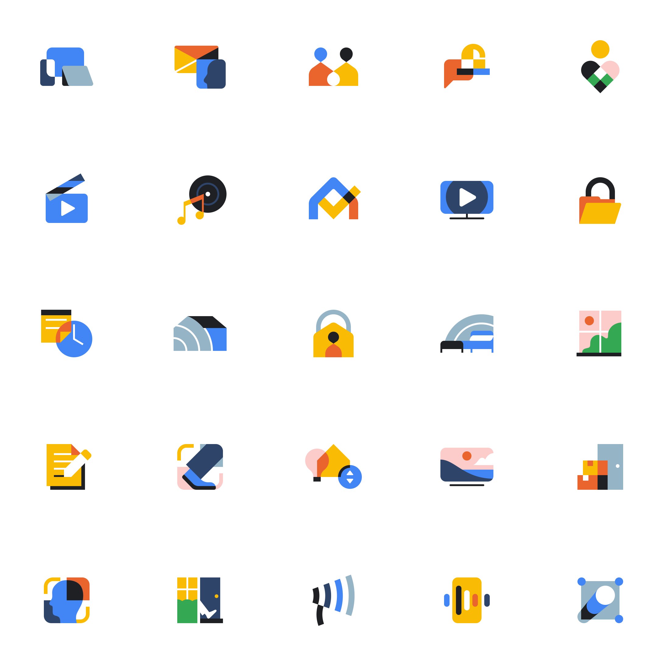
We crafted the icon design language by distilling the essence of the larger system to a 64x64 pixel grid, and reducing the expanded color palette. From this system, our team designed a unified collection of icons that we’re able to expand consistently.
Credits
Creative Direction: Dan Stack & Ian Sigmon
Illustration: Jaedoo Lee, Dan Stack, Ian Sigmon, Adam Anderson, Damian Orellana, Jay Quercia, Nick Slater
Animation: Dan Stack, Jaedoo Lee, Jordan Scott, Jade Kuzak
Production: Ashley Carey & Tess Harris