Nest Renew
Roles: Direction, Design & Animation
Google tasked Hobbes with creating multiple illustration and animation systems for Nest Renew, a service that incentivizes users to utilize cleaner energy within their home. Our goal was to define methods and parameters that allowed us to execute on the organic and textural visual direction the client had established, in a consistent and scalable way.
Expanding on the paper-cut style established by the client for spot illustrations - Jesse and I collaborated in defining the look and feel of the painting illustration system, as well as the motion systems for both styles.


Spot Illustrations
We crafted dozens of illustrations for both dark and light modes of the product, and used a combination of traditional and modern animation techniques to bring them to life. Staying true to the organic qualities of the paper-cut style, we created the animations at a lower frame rate, allowing us to handcraft the variances between frames.
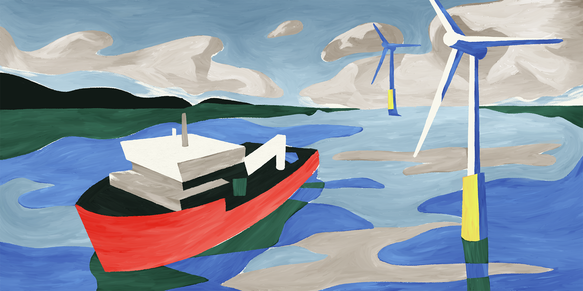
Paintings
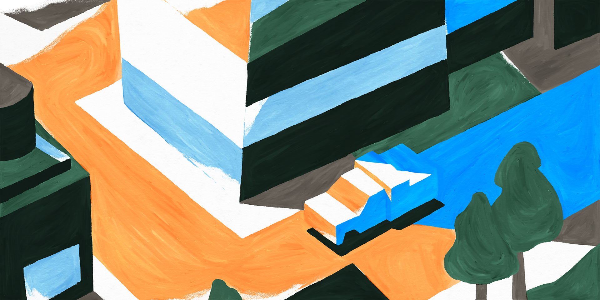
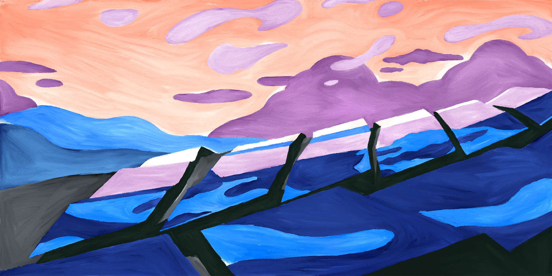
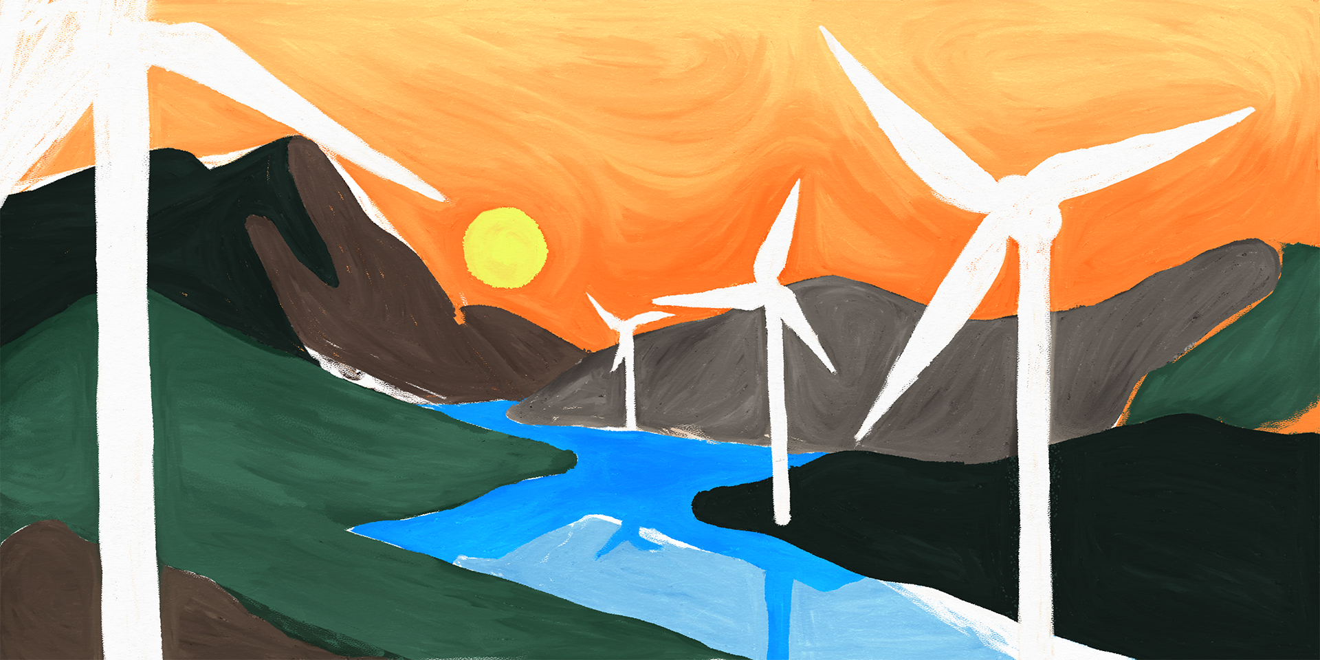
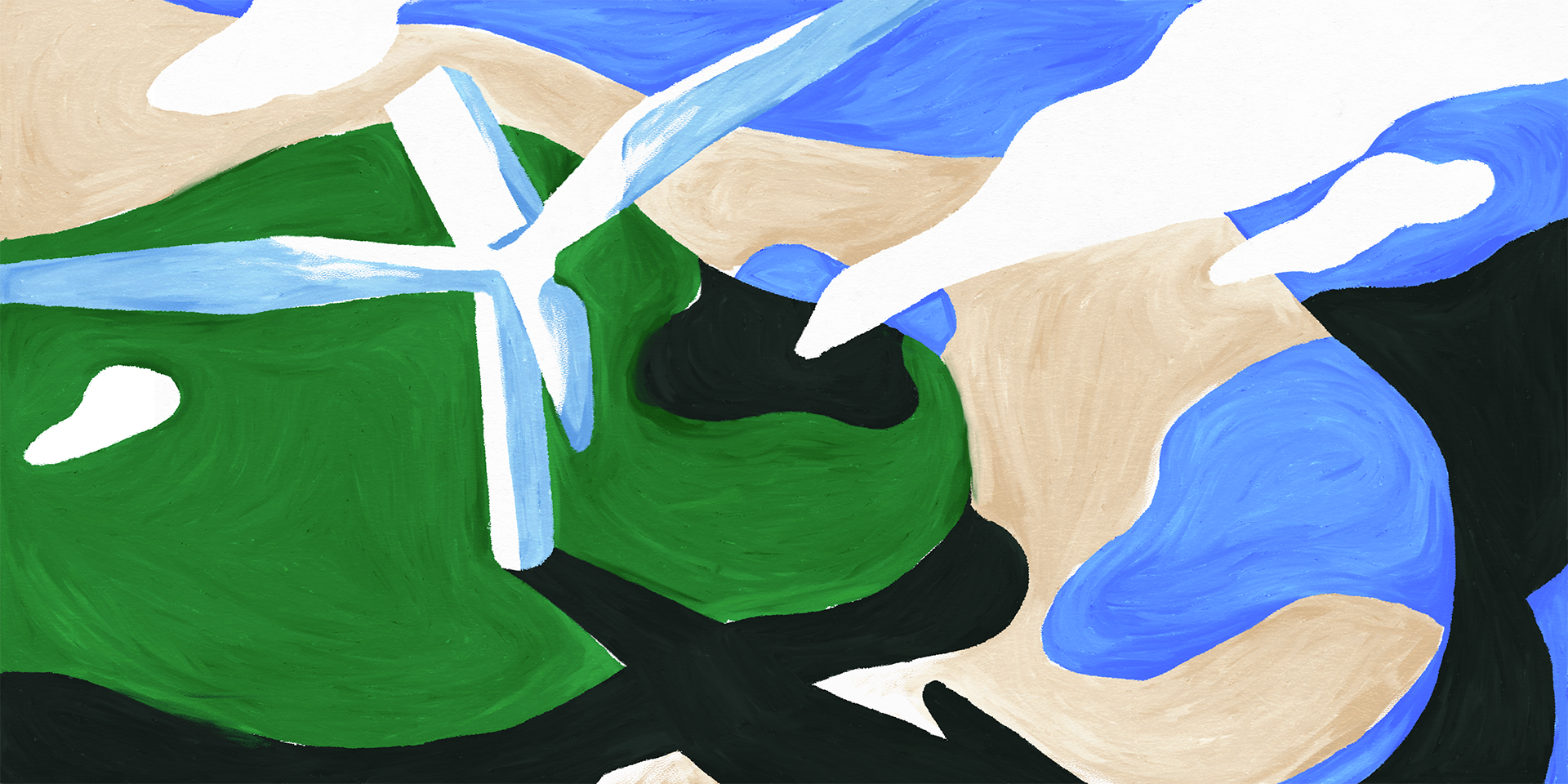
By mimicking the nuances and imperfections of real paint, we were able to achieve a more textural quality in the digitally crafted landscapes. We considered details such as the directions of brush strokes around forms, gaps in the paint that might reveal the canvas behind it, and darkening the tone where paint might pool.

Variety
To differentiate paintings featuring the same subject matter, we utilized a variety of different camera perspectives, palettes, and compositions. The result was a collection of paintings that accomplish the same core objective in different ways.
Credits
Creative Direction: Dan Stack
Illustration: Jesse Kassel, Dan Stack, Evan Kempinski
Animation: Dan Stack, Jesse Kassel
Production: Ashley Carey & Tess Harris
